Glow Up by Ysa. A Cohesive Brand and Digital Experience
THE STRATEGY
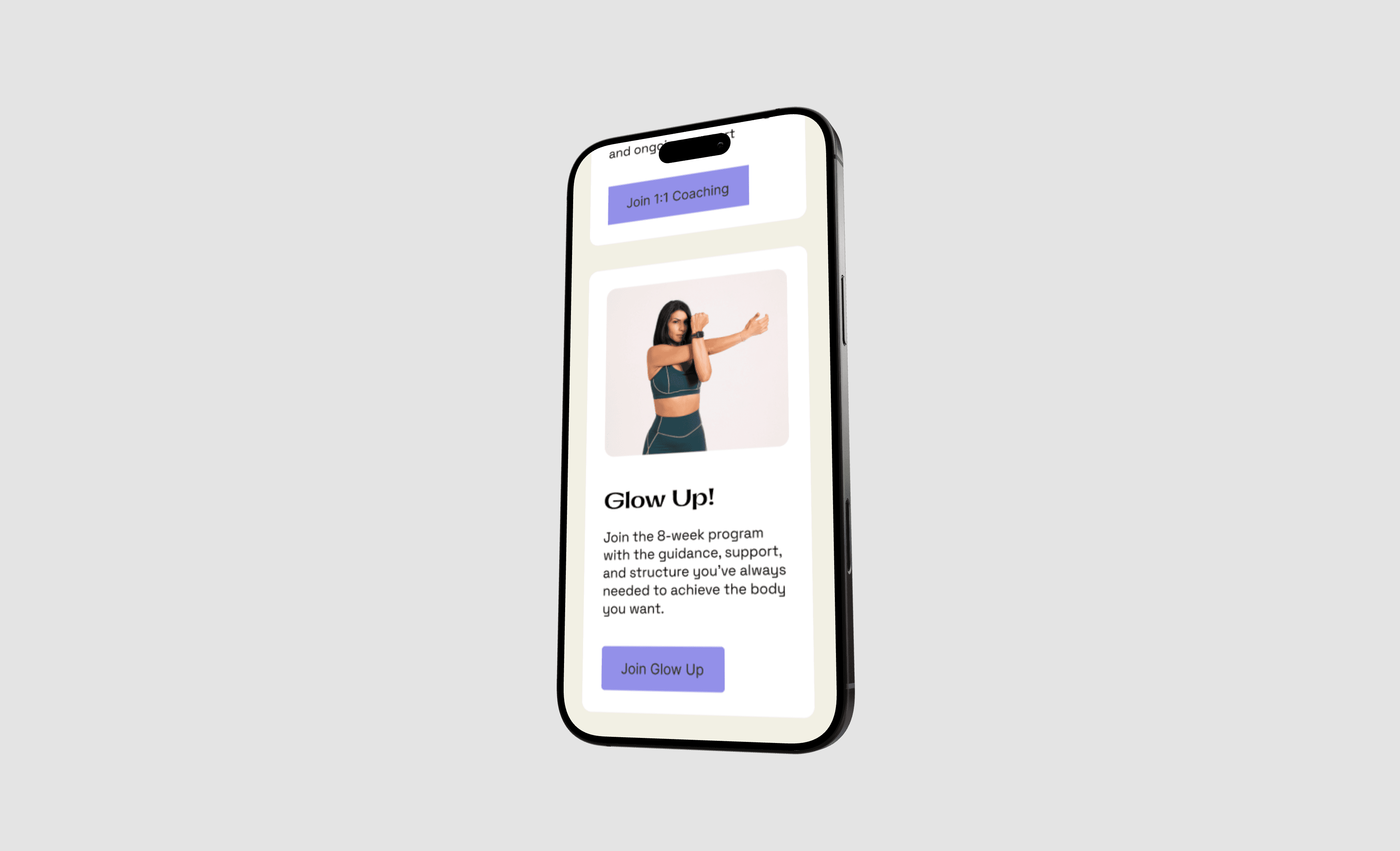
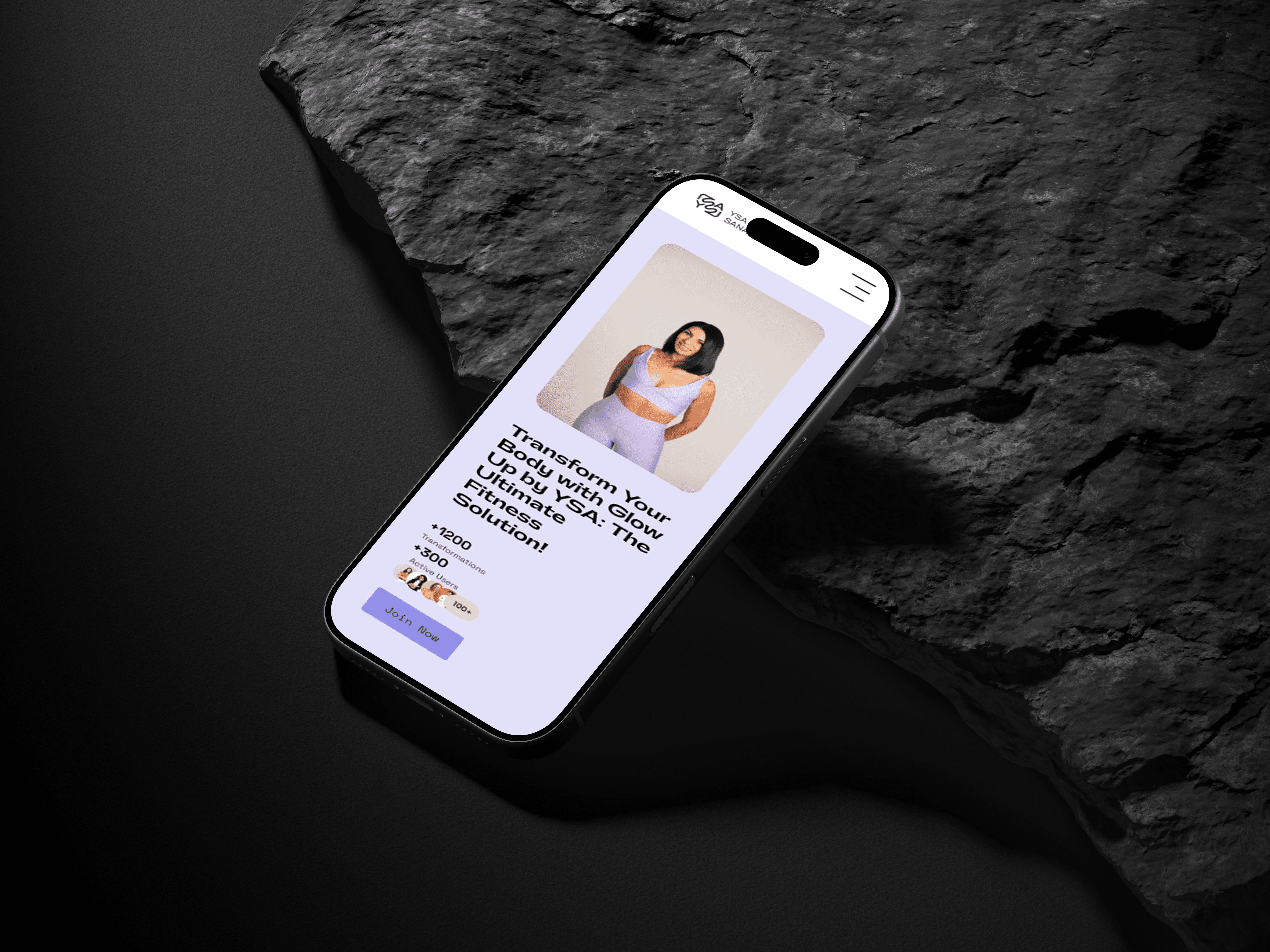
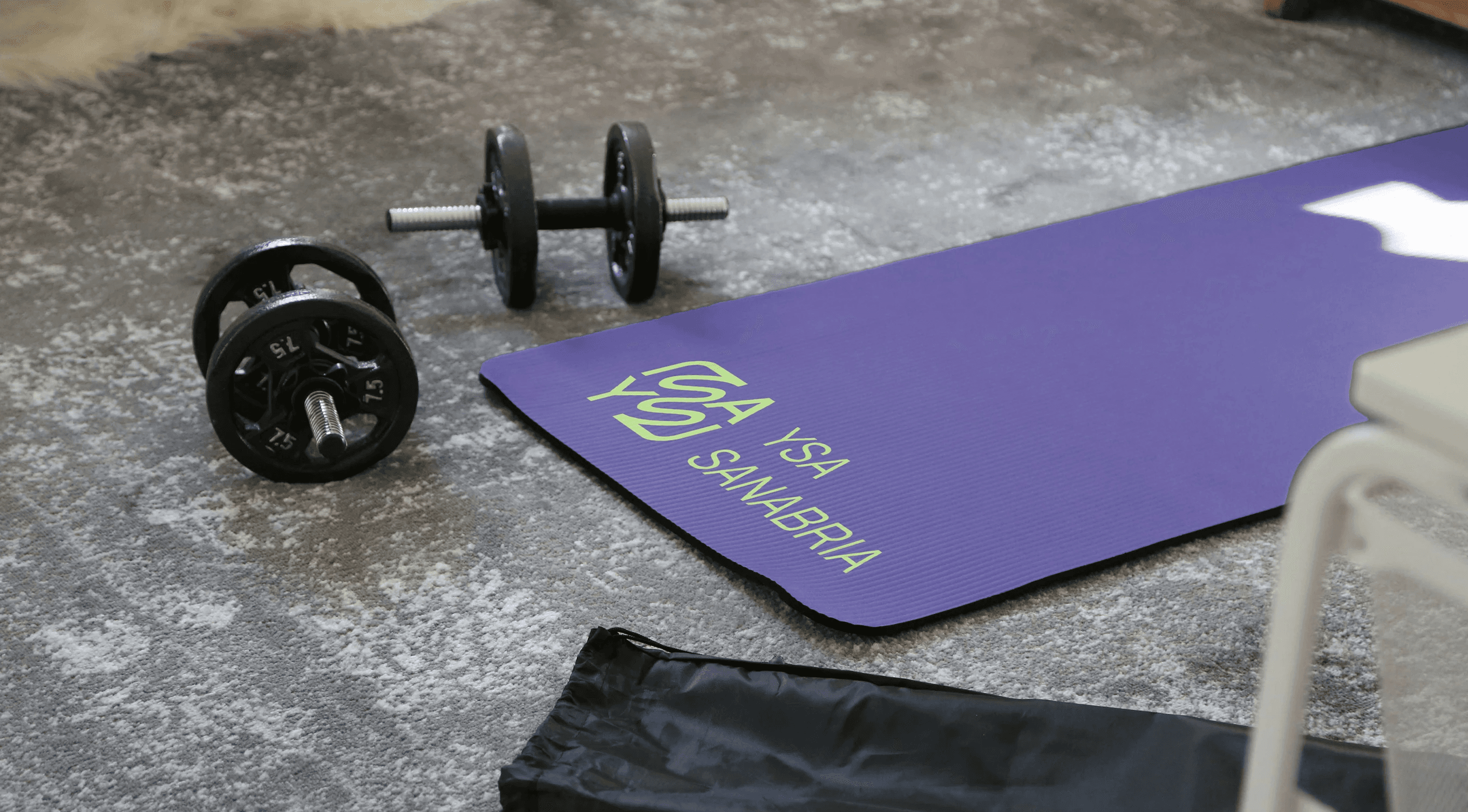
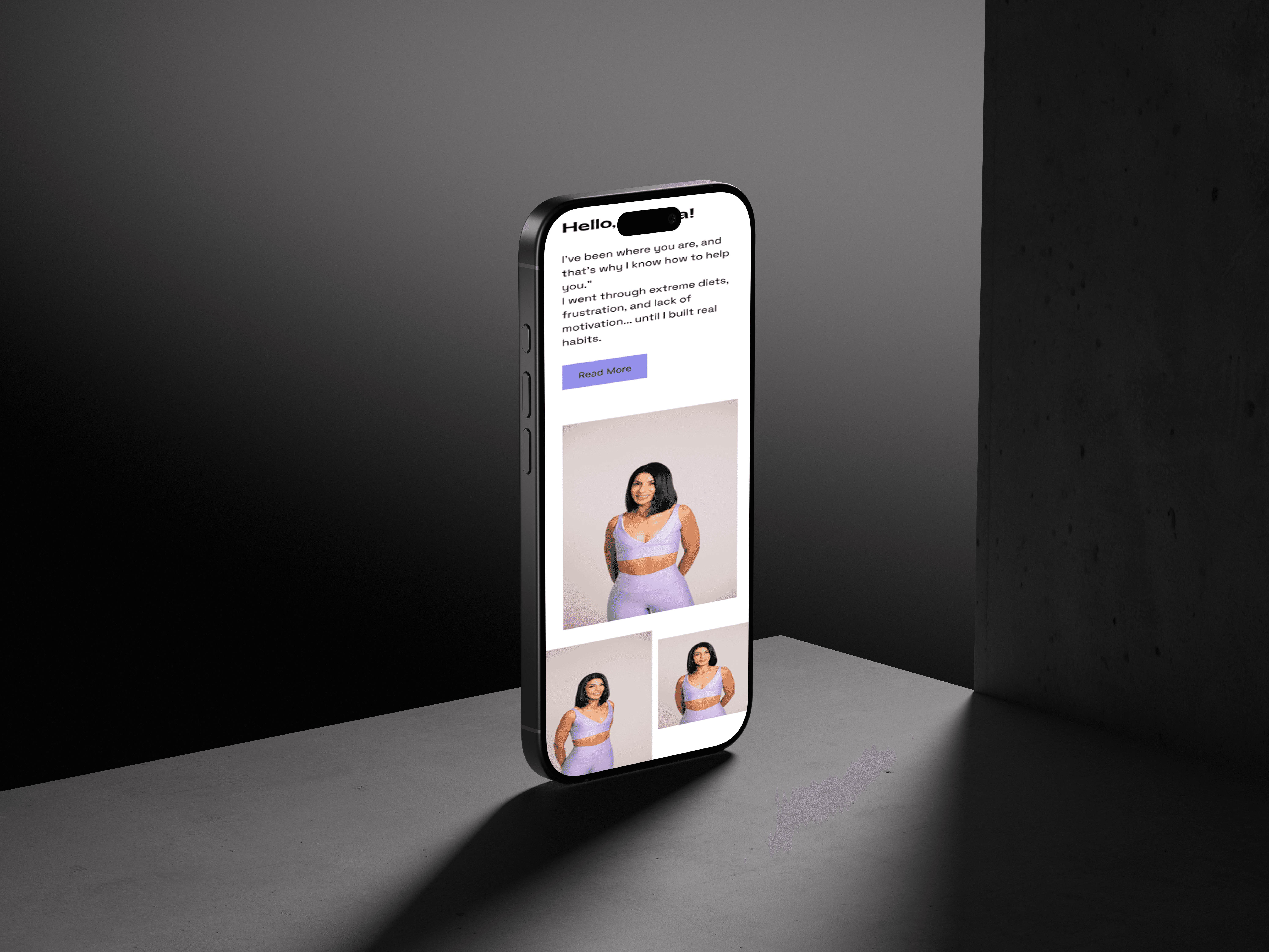
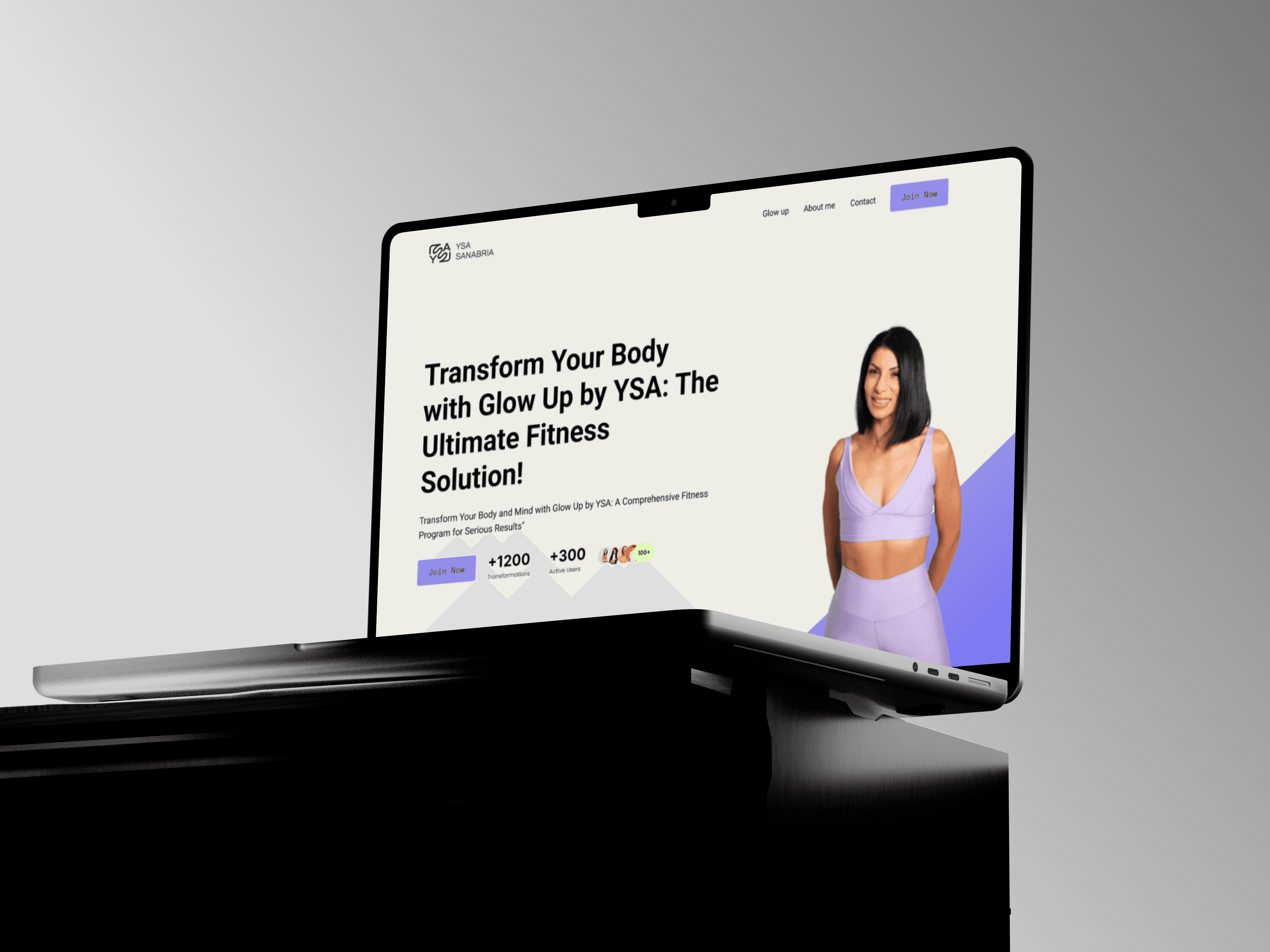
Our strategy was to turn all of that scattered information into a coherent system. We started by clarifying the brand strategy and messaging, defining who they were really speaking to and what those people needed to hear first. From there, we redesigned the structure of the site so that visitors could move through a simple, logical path: understand what Glowup is about, see how the programs work, get their questions answered and decide how to start. Visually, we refreshed the identity to feel energetic yet grounded, aligning colors, typography and imagery so that the brand felt the same on the website, social media and any future assets. Every design decision was made with one question in mind: does this make it easier for someone to understand, trust and act?
THE RESULTS
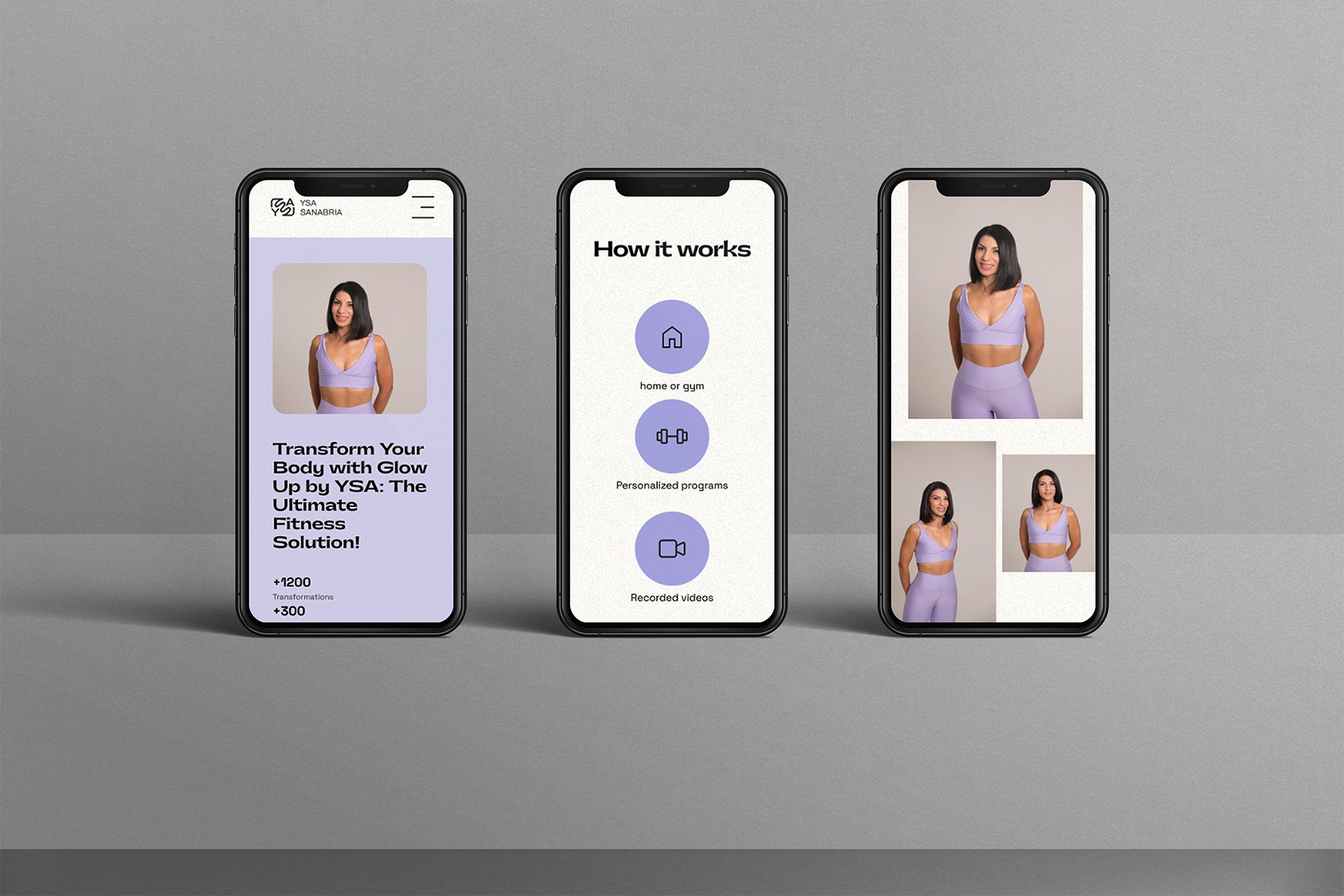
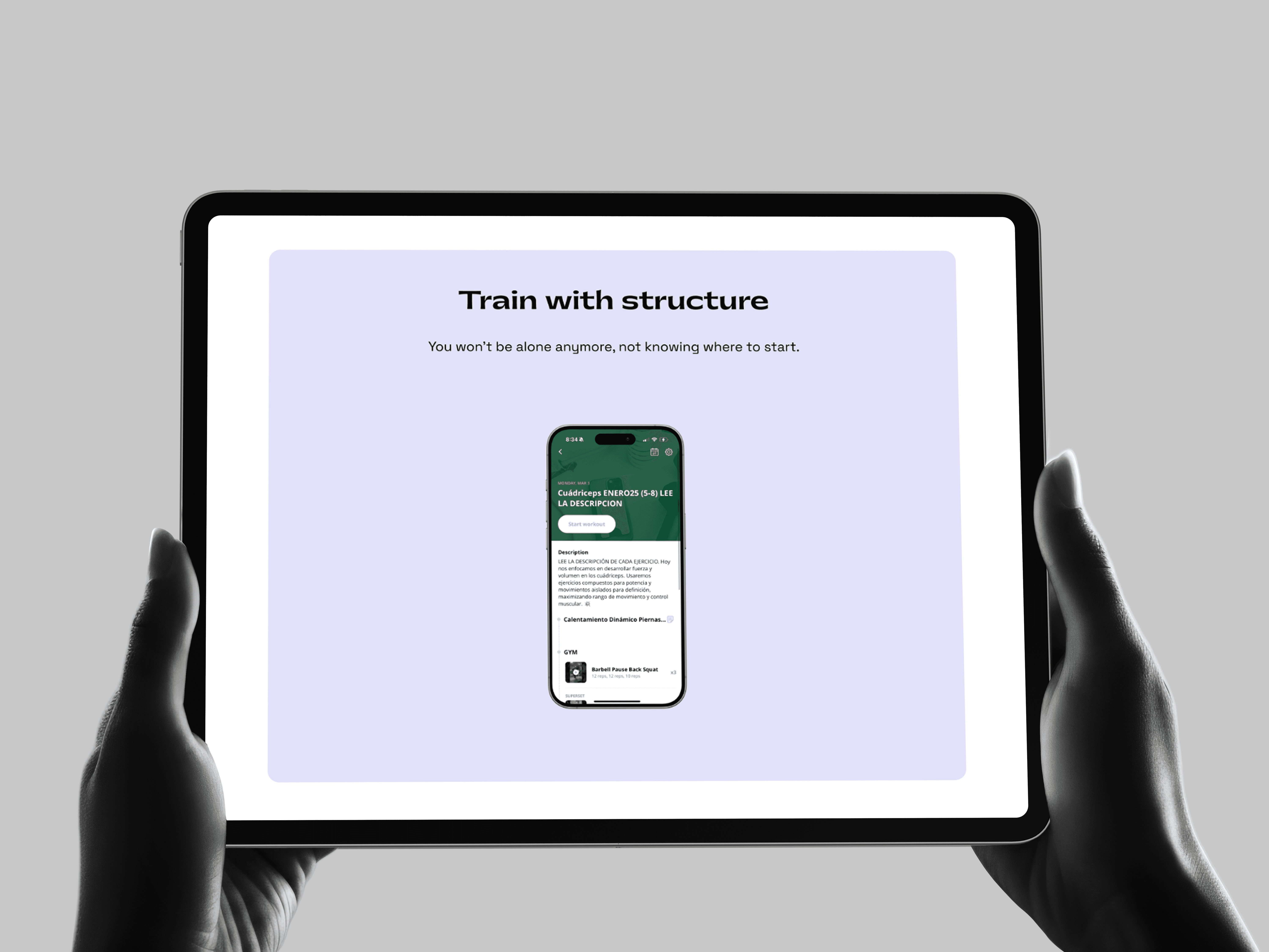
The result is a website and brand system that finally support where Glowup Fitness is heading, not just where it started. What used to feel scattered across platforms now feels like one brand: same tone, same visual language, same promise whether someone lands on the site, scrolls Instagram, or walks into a session. The offer is easier to understand at a glance, the path from curiosity to sign-up is shorter, and every touchpoint reinforces trust instead of creating friction. For the Glowup team, having a structured design system means new pages and materials can be created faster without diluting the brand. For their audience, it means a smoother, more confident journey from "what is this?" to "I'm in."